
I love fonts.

When my daughter was a freshman, I took her with me to Parent Teacher conferences. Her geography teacher showed me a paper she'd written for his class. Then he turned to her and asked a bizarre question. "What made you choose this font?"
I hurriedly looked
at the paper, but it wasn't written in Script
MT Bold or in chick. In
fact, it wasn't even written in Comic Sans. Oh no. It was written in the very respectable Courier New.
Wasn't everyone's? This was an honor's class after all.
So she told him that
Courier New was the font most frequently requested by agents and editors
because it was so easy on their eyes, and that she and I had possibly gotten a
little snobby about always using it.
He thought that was
very interesting, and said he loved to hear stories about why people chose fonts.
I'd never thought about it before. By that point I had gotten so used to
Courier New that I changed every document I opened to Courier New before I read
it. (Quick note: after writing with Sabrina so much, I can now handle Arial as
well.)
The default font on
my computer is Times New Roman and
if I start typing in it, my mind will go completely blank. Sometimes it takes
me a minute or two to figure out what is wrong, and then I switch to Courier
New and everything is good again.
I once watched a
whole documentary about the Helvetica Font*, and sometimes can be reduced to
tears by the stupidity of blogger's font interface.
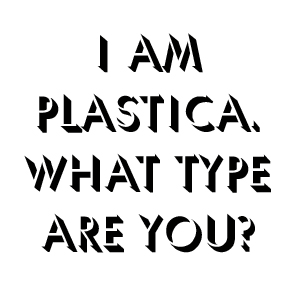
Even if you're not a
font snob like me, you'll enjoy this video:
By the way:
*This is actually Arial again, because they are very similar. Helvetica fans, please forgive me.
My word processor's default font is Calibri. (WHY?) I've changed the default font many times, but it always resets itself to Calibri. I always use Times New Roman when I write. I guess it's because I date back to the days when personal computers first became available to the masses and professors didn't really like non-typed papers. So they insisted everyone who used PCs use TNR. (Of course, that was in the days of dot matrix printers...)
ReplyDeleteI can't wait to check out your links.
I'm a Times New Roman girl too. That was the font all of my professors in college insisted on. So I still type in that font to this day. I was surprised to learn that editors and agents preferred New Courier. I thought the whole world conformed to Times New Roman. Lucky for me, font is so easy to change to New Courier for submissions.
ReplyDeleteArial? I almost never use arial, unless that's what yahoo puts email in. I always write in Calibri ::glances up nervously to see if Connie is looking::
ReplyDelete:)
However, from an editor's perspective, Courier is the best thing from sliced bread. It really absolutely truly is SO much easier on the eyes. I would write it a love letter if I could. In courier, of course.
Oh, and that quiz was awesome! (The video too, even though I hate comic sans with a fiery passion. Especially if people ever submit a story in it. Please never submit a story to a magazine in comic sans).
DeleteMy quiz answer was Archer Hairline, which is actually a pretty cool looking font.
That's strange, Sabrina. Maybe it's Sheena? I don't know. I just know I've seen a lot of Arial lately. Archer Hairline is one font I hadn't seen on the personality quiz yet. Very cool personality, Sabrina. And it is a nice font.
DeleteMy computer keeps wanting to use Arial, but I put everything into Times New Roman, too. Awhile back I read that was a font many agents and editors preferred, and I actually like the look of it, myself. How interesting that the teacher was so immersed in that question, though.
ReplyDelete